Coming up with the aesthetics for my site took a long time. I knew I wanted a specific look, which limited my choice of theme by quite a long stretch. It’s safe to say that ‘Lovebirds’ was the closest I could find to my ideal look. I especially liked the way the header image stood to the side, as it allows more to be seen on the ‘above the fold’ section of the sight, i.e without scrolling something will have already caught the users interest. It also makes the navigation clearer, whilst allowing the appearance to be understated enough.
A selection of name ideas:
The theme clearly appears to a female audience. It also has a cute, young and accessible feel. It has enough to stand out from other blogs of a similar topic. In future, I would love to create my own theme designs. For now, it is enough for me to carry on using this one while I get to grips with the more complicated aspects of editing a WordPress site.
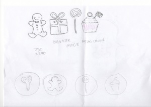
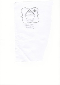
In terms of my logo, I also had a really clear idea of what I wanted, and have been set on this since. I drew up some sketches, emailed them to a graphic design student whom I have worked with before, and he made me up a great digital image in less than an hour. It was an ideal way to kickstart my blog and give me inspiration to get started, and I was really pleased with the results.
It terms of the posts themselves, I quickly learnt that high quality photography was the difference between a professional looking post and a not so professional looking one. I found my photography skills improving. Even though I don’t own a super high quality camera, I found that with enough consideration towards lighting and composition, I could improve the look of my pictures by a long stretch. For example, I found that natural light was absolutely essential, so it helped that the weather slightly improved and the days got longer as my blog progressed. I also tried to think of more innovative ways to present the food, e.g. stacking cookies on top of each other, even taking a picture of something with a bite taken out of it. This, combined with a better knowledge of how to edit in Photoshop thanks to the BSU Publishing Lab, meant my images seemed to get better and better. There may still be room for improvement, but I can safely say some improvement has definitely already been made.


